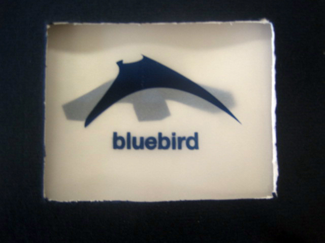
my book was designed around the poem "Bluebird" by Charles Bukowski. the idea was to convey the sweetness of a bluebird with the gritty, claustrophobic imagery found in the poem.
the majority of the type in the book is Helvetica Neue; it was used as it is a simple font that would be legible without distracting readers from the images on the page. the text is also centered in the upper right or left and bottom right or left, depending on the page, allowing the images to be placed in the center to attract the eye, as although the book is based on the poem, the images are the most important factor.
most of the colors in the book are blue, as they are based on the bluebird. anything that isn't blue is meant to be a different color, as it goes with the poem as not belonging in the place that its in. for example, the page with the whiskey and cigarette smoke features other colors, as the whiskey and cigarette smoke in the poem are meant to overwhelm and subdue the bluebird in the speaker's heart.
the grid served primarily to align the text itself. once that was in place, the images were used to break out of the alignment of the grid, by lying over the text or even crossing pages. this helps provoke feelings of chaos and claustrophobia.
in my opinion, the best part of the book is the last page, in the bottom right, where the last stanza of the poem is. the way it sits over the image of the mangled bluebird is very powerful to me.


0 comments:
Post a Comment