my final design explored texture, as well as shape. for this design, i wanted to contrast the ideas of fire and ice, as well as the idea of destruction versus beauty. to do this, i took the background picture, which i took from the internet, and edited the levels to emphasize the peaceful scene it shows. on top of it, there are the two interlocked squares of images of fire and ice; i hand-selected them with the tablets and added a faint drop shadow to give the impression that they were cut and pasted out of actual paper. the ragged edges contrast with the beautiful image in the background for a surreal picture, and the simple squares are a reflection of my style.
Wednesday, May 23, 2012
blog design #2 - shape experiment
this design utilizes shape; the pink light was taken from another picture i took and edited to look more organic and paint-like. the squares were edited to feature the glow, which gives the impression of an intense light. once again, i tried to achieve the simple style that i prefer, but i also wanted the picture to give a sense of comfort to be contrasted with the stark exclusion of the pink square in the center.
blog design #1 - line experiment
for this design, i wanted to play with lines as the element of design, i used a picture that i took and simulated a simple curve around my friend's head using only straight lines. this is an example of my design style as it is very simple, featuring only the white lines over the out-of-focus picture, but i think it stands out well as a reflection of the geometric influences that can be found in nature.
Friday, May 11, 2012
senegal t-shirt
my shirt uses the lion from Sénégal's coat of arms (below) and compares it with the U.S.'s national symbol, the eagle. the two silhouettes are used to represent contrasting ideas and cultures between the two countries, but on the back, the silhouettes come together in an abstract form to display our cultures meshing together.
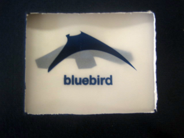
bluebird
my book was designed around the poem "Bluebird" by Charles Bukowski. the idea was to convey the sweetness of a bluebird with the gritty, claustrophobic imagery found in the poem.
the majority of the type in the book is Helvetica Neue; it was used as it is a simple font that would be legible without distracting readers from the images on the page. the text is also centered in the upper right or left and bottom right or left, depending on the page, allowing the images to be placed in the center to attract the eye, as although the book is based on the poem, the images are the most important factor.
most of the colors in the book are blue, as they are based on the bluebird. anything that isn't blue is meant to be a different color, as it goes with the poem as not belonging in the place that its in. for example, the page with the whiskey and cigarette smoke features other colors, as the whiskey and cigarette smoke in the poem are meant to overwhelm and subdue the bluebird in the speaker's heart.
the grid served primarily to align the text itself. once that was in place, the images were used to break out of the alignment of the grid, by lying over the text or even crossing pages. this helps provoke feelings of chaos and claustrophobia.
in my opinion, the best part of the book is the last page, in the bottom right, where the last stanza of the poem is. the way it sits over the image of the mangled bluebird is very powerful to me.
Wednesday, May 2, 2012
bluebird (in progress)
the theme of my book is a visual interpretation of Charles Bukowski's poem "Bluebird." the purpose is to align the text to the grid in the corners, then have the pictures interact with the text and break out of the grid to evoke a chaotic mood. the poem, while beautiful as a whole, has very gritty imagery, and i wanted to convey that. the text and the recurring images used for the "bluebird" are the key unifying traits throughout the book; most of the effects are either blur, blend, or extrude & bevel. the "extrude & bevel" tool is key as it makes the images look more rigid and claustrophobic, mimicking the feelings of the trapped bluebird in the poem. right now, my favorite part is the second to last page of the poem, which is partially shown in the first image.


